


Definition
Visual Hierarchy is used to rank design elements and influence the order in which we read them. By using the principles outlined below, you will see how a few simple design principles can help make your messages stand out.
Just like all things we see, marketers, designers, and fairly well anyone who tries to communicate to us graphically, has been stewing for years to come up with the best way to lure us in and feed our eyes with the information they want you to see.
It is actually a handy tool because generally speaking, we are looking for the information and we don't want to have to pick through irrelevant info to get the good stuff. Meaning visual hierarchy done well can be beneficial to both parties - just like how businesses use targeted advertising to be seen by customers who are deemed 'relevant', is this actually a bad thing? As opposed to being targeted by a business selling you hair products, and you are a bald man.
At George & Willy our visual hierarchy is based around creating, for you, a 'Better Way To Display' with our display boards, menus, and creative signage options. Whether it's using a pen as a graphic design tool on our Studio Roller, using the Baker Menu, or arranging our Wooden Letter Board tiles, we aim to create the best possible canvas for your space to be seen.
Principles
The world of graphic design is as ever-changing as the world of fashion, however, the basic principles remain the same, and good design will remain good design.

Bauhaus, a School of The Arts established in the early 1900's, Germany. It morphed into a worldwide movement in modern art that is still represented in graphic design through to architecture globally today.
It's like how 90's clothes are still being worn two decades later, and how putting on Johnny Cash, Tina Turner, or The Beatles will forever get your foot stamping.
Good graphic design will always be good no matter the decade.
Reading Patterns:
All cultures read from the top down and most cultures read from left to right. But while that knowledge is important for graphic design on page, there is a bit more to it than just that.
People first scan a page to get a sense of whether they are interested, before committing to reading it. Scanning patterns tend to take one of two shapes, “F” and “Z,” and you can take advantage of this in your design.

F-patterns apply to traditional, text-heavy pages like articles or blog posts.
A reader scans down the left side of the page, looking for interesting key words in left-aligned headings, then stopping and reading (to the right) when he or she comes to something interesting.
The result looks something like an F, or sometimes an E depending on how much interest you have created.

NYC Till & Sprocket drinks menu, by Will Gardner
Z-patterns apply to other sorts of pages, like ads or websites, where information is not necessarily presented in block paragraphs. A reader’s eye first glances across the top of the page, where important information is likely to be found, then shoots down to the opposite corner at a diagonal and does the same thing across the lower part of the page.
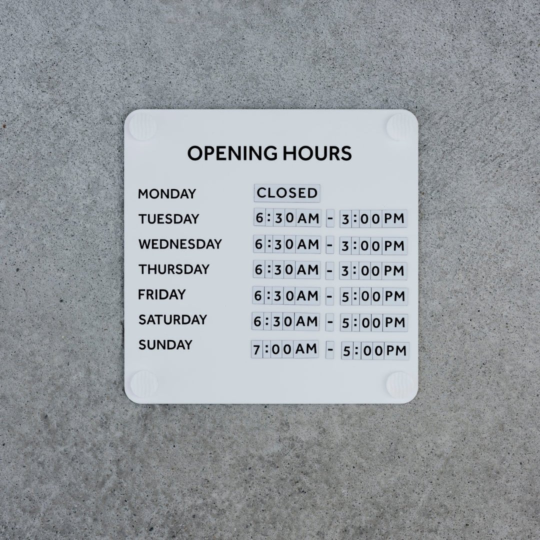
Size Matters
This one is quite simple; people read bigger things first. Having larger lettering sizes is enough to override the left-hand hierarchy, and used in conjunction with left-hand placement, you will have a strong formula to get your message noticed.

The new George & Willy Beer Menu, launching on our site soon.
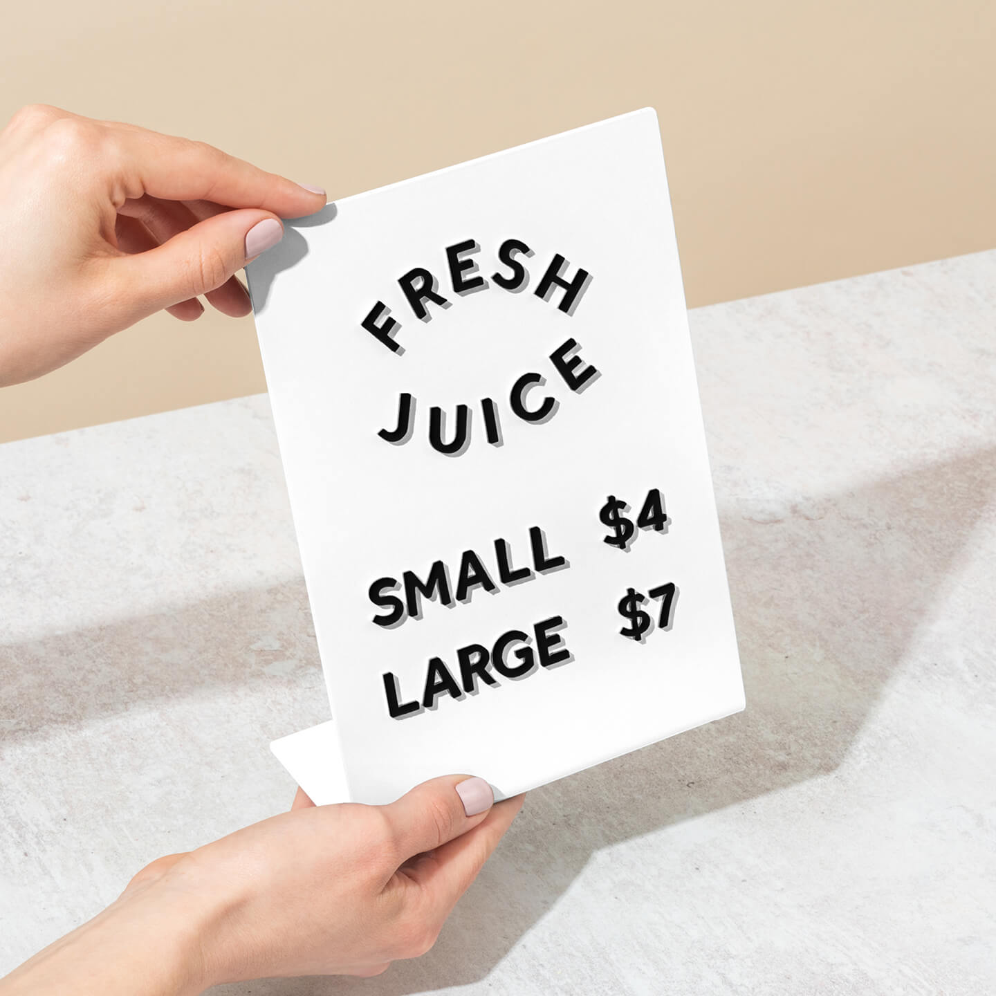
Space
Another way to give your content attention is to give it ample space. Giving your words negative space surrounding them gives the same effect as you would get from taking to it with a highlighter.
Which leads us to the next principle, colour.

Kerning or tracking is an easy way to give your letters space and make them stand out. On the George & Willy Studio Roller.
Colour
Text colour, contrasts and highlights all work in unison to direct the viewer to key information through a visual hierarchy again. Colour psychology is crucial in how you want the viewer to feel when they see your message.
Yellow resembles optimism, clarity, warmth, whereas green resembles peace, growth, and health. This principle is an interesting one when you think about brands you know that represent this.

Dukes Coffee Roasters, Melbourne, Australia.
We have another blog post on the 'Psychology of Colour' which touches a lot more on this and is worth the read.
Type/faces or Font
Choosing a typeface that relates to the tone you want to set is key. Creating visual hierarchy in menus helps group relevant information and shows you where sections stop and start.

The George & Willy Park Letter Board
We have always loved the simplicity of a sans serif font and found it a great font for menus. Having a letter layout which is so simple allows it to be used in any style of space. We use this product on our Magnetic Letter Menu if you would like to see what we mean by this.
When you look at each individual letter in Effra it is hard to imagine any letter being more simple. It is a very clean font for menus and suits uppercase with a bit of kerning.
As designers, we love thinking about the smaller and sometimes more intricate pieces within the puzzle that make up a whole product.
Most of the time we all do these things without actually cognitively thinking about why, how, or what it is going to achieve, it either just happens or it looks nice and we run with it. If you see menus, signs, or images that show good examples of visual hierarchies then tag us in them or send them through!